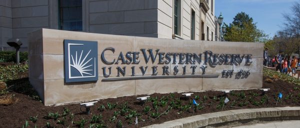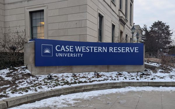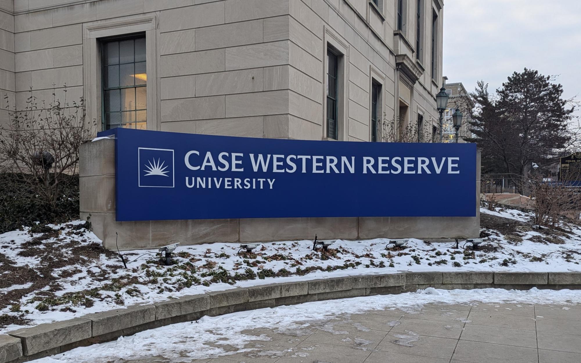

On Jan. 10, students who returned early from winter break were greeted by a stark change to an iconic part of campus: At the Euclid Avenue and Adelbert Road intersection, a blue sign with Case Western Reserve University’s new logo had been placed on top of the previous stone logo.
The background of the new sign consists of “CWRU Blue,” a shade of blue that is brighter than the old logo’s dark blue letters. The metal letters of the old logo at the Euclid Avenue and Adelbert Road intersection—which were placed on top of the flat stone wall to create a 3D effect—were removed from the stone before a thick blue sign bearing the new logo was installed with a crane. The new logo is printed with white letters on a CWRU Blue background, taking away from the old 3D appearance.
Since CWRU changed its logo in June 2023, the university has updated many physical items to reflect its new look, from sports uniforms to campus merchandise. The old logo had been in place since 2007, and last summer’s redesign was aimed at making CWRU “much harder to miss,” according to a video published by the university promoting the change.
Student reactions to the new sign have been largely negative, though there have been a few positive comments. One student said that “it looks pretty good” and “really sets us apart.” Another student said, “I feel like it’s pretty nice,” while still admitting to liking the old one a bit more because “it was more authentic.”
“It looks better during the night time [than] during the day,” one student said, adding that “the blue is kind of ugly, [a] very stark contrast to all of the tan and gray I see around me.”
One student said, “I don’t like it, and it was cuter before, and it’s just not aesthetically pleasing anymore, and it’s just not cute.”
A few reactions were visceral. “I think it looks disgusting. I don’t really love it,” one student said. Another stated, “I hate this sign. The old sign was so much better. It looks like it has history; it had the date [of the university’s founding] on the old sign.”
A few students agreed that CWRU needs to “bring back the stone.” A different student said, “When I first saw a photo, I thought it was edited.”
“Every time my mom comes to visit me in Cleveland, she always makes me take a picture in front of that sign, but I know she’s not gonna want to take a picture anymore,” one student joked.
The old stone sign was created between 2012 and 2014. Before that, there was a patch of flowers around the quarter circle where the sign stood. In the late 2000s, the spot held a sign for UH Cleveland Medical Center.
Signs on Euclid Avenue have proven to be rife with controversy. In 1973, six years after the Case Institute of Technology merged with Western Reserve University, CWRU erected a sign proclaiming the entrance to “Case Institute of Technology of Case Western Reserve University” on Euclid Avenue. This prompted an incensed article from The Observer calling the move “nothing but appalling” and something that “negates the whole spirit of federation.” The article claimed that alumni had a large role to play in the sign’s creation, and, in the spirit of the 1970s, it called for a direct form of protest against the sign: “But maybe people could just wander by and stick some leaflets or things on the top of the sign, eliminating the Case portion. It would be a symbolic gesture, but one that might register in the hearts of the people at fault.”
Additional reporting contributed by Executive Editor Shivangi Nanda.


