


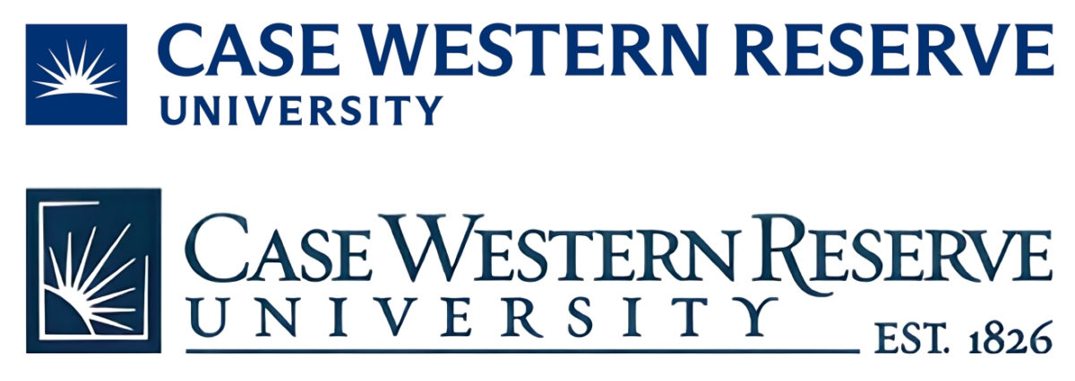
In early June, Case Western Reserve University changed its official logo. The updated design is still recognizable since it is a modernized version of the logo that was in use from 2007 until the middle of this year. The new logo features simpler and thicker letters, a redesigned sunburst and a brighter shade of blue now called “CWRU Blue.” Reactions to the design change have been mixed at best, with some praising the new logo’s simplicity while many others have openly voiced their displeasure with its generic and modernized style. The Observer maintains that criticism of the new logo is entirely warranted as its dull design fails to represent our dynamic and innovative community.
In a video uploaded on June 5 titled “CWRU Goes Bolder, Brighter with Brand Update,” the university justified its decision to change its 16-year-old logo. Despite CWRU’s record for achievement and innovations, “we still can get lost in a crowd,” the narrator says, as CWRU’s old logo appears alongside 21 other university logos (not counting the two that were repeated). “So we decided to simplify, modernize and demand to stand out. We brightened our colors and emboldened our seal. We’re still all CWRU, just much harder to miss.” The university’s rationale for the logo change is understandable and even laudable, but the new logo’s execution fails to live up to CWRU’s lofty ambitions.
Despite the university’s assertion that the redesigned logo is “bolder” and “brighter,” almost every aspect of the new logo is a visual downgrade from the old one. The new color of CWRU Blue is the only defensible change. While the dark color of the old logo was aesthetically fine, CWRU Blue is not so bright that it appears comical and unserious. If the university had kept the layout of the old logo but only added CWRU Blue, most in the community probably would have been welcoming or ambivalent about the change. Instead, CWRU decided to make the rest of the logo undeniably worse.
The new sunburst that features prominently on the left side of the logo is less appealing than the old version, having lost its distinctive half-finished white box. The old sunburst was asymmetrical and appeared at an angle, rising from the east and bursting out of the box’s thin outline. This was intended to physically represent the university motto “Think Beyond the Possible,” embodying the bright future we are destined to face through the educational and research efforts of CWRU. The new one is symmetrical and sits horizontally. The new sunburst also attempts to include the detail of the sun rising over a horizon, but it fails in getting this message across. Instead of having the clear appearance of a curved horizon at the bottom, the logo’s extremely simplistic design makes the curved horizon look like the outermost rays of the sun. One could be forgiven for mistaking this new sunburst for a palm leaf.
The old logo had a unique phrase that appears nowhere on the redesigned version: “Est. 1826.” While many universities put their founding year in their official seals, exceedingly few include them on their horizontal logos. CWRU wants its new logo to “stand out” and be “harder to miss,” but it does not accomplish this goal by removing one of the most unique aspects of its old logo. The university should proudly display its nearly two centuries of history in its marketing, not cut out that achievement for the sake of simplicity.
By making the letters simpler and thicker, the new logo appears generic and lacks any distinct personality. The old logo’s serif font was thin and dynamic. The first letters of the words “Case Western Reserve” stood above the rest of the text, and the first “R” in “Reserve” had a hook that broke through the bottom line of the text, giving the logo some character. In contrast, the letters of the new logo—written in a font that could be described as sans serif—appear chunky and lifeless, with no indication of any unique stylizations. The word “University” also sits alone in the bottom left corner of the new logo; a large chunk of dull white space replaces the horizontal line underscoring “University” and the characteristic “Est. 1826.” The net result of the logo’s textual changes is a bland and unappealing design that, despite CWRU’s claims, can easily “get lost in a crowd.”
CWRU has a recent habit of redesigning its logo. In 2003, the university introduced a logo meant to emphasize the “Case” part of CWRU’s name. Not only did that poorly designed logo repeat the word “Case” twice, but the image to the left of the text was widely ridiculed because many in the community agreed that it resembled a “fat man carrying [a] surfboard.” In 2007, the logo was changed to the one that we were all familiar with until the June 2023 redesign. Given the obvious distaste that many in the community have for the new logo, it is certainly possible that it will be replaced in the near future, but this kind of constant rebranding is a poor look for CWRU.
For a university to change its logo three times in 20 years is bizarre and exasperating; frankly, it’s embarrassing. There is a benefit to having a great logo that lasts for decades since it displays an organization’s continuity and establishes itself as a respected and recognizable institution. We should not want our university to unintentionally cultivate a community of students, faculty and alumni who favor old designs and are dissatisfied with branding changes that they believe denigrate the image of their beloved institution. In addition, all personal merchandise featuring the old logo becomes outdated, and those who prefer the old logo can no longer buy goods that feature it at the University Bookstore. It is especially frustrating to purchase new hoodies, shirts, bags, folders and mugs when the new logo on them is uglier than the old one. Though it can signal a new direction for an organization, rebranding has its downsides. At its worst, it creates a division between the generations of alumni that have attended this long-standing institution.
CWRU’s new logo is an embarrassment and stains the reputation of success that built our historic institution. Nevertheless, despite the new logo’s mediocrity, our community is nothing but exceptional. Everyday at CWRU, thousands of students and faculty members of wildly differing backgrounds tackle difficult subjects in the classroom, break barriers in their fields, conduct groundbreaking research, push the limits of innovation and think beyond the possible. They deserve an inspiring logo that reflects their incredible achievements.