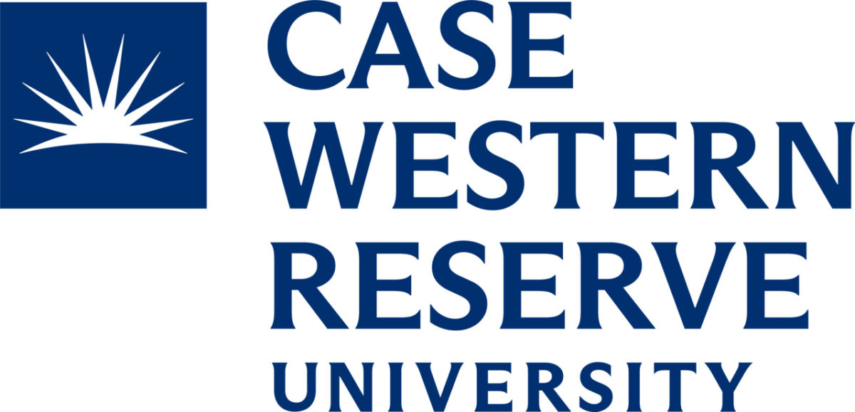
On June 2, Case Western Reserve University students awoke to news in The Daily that the university was unveiling a new “visual identity.” Described as “bolder and brighter,” this includes a new logo, a brighter color scheme and different fonts. This is the university’s third change of logo since 2000.
Most noticeably, the previous sunburst has been replaced with a new modern and simplified version of the original design, with a new font and color palette to go with it. Another change to CWRU’s logo is the new color scheme of “CWRU Blue,” a lighter blue replacing the old navy blue.
University Marketing and Communications (UMC), the department responsible for rolling out the rebranding and media reactions, noted that “it had become increasingly clear that the 2007 logos did not serve the university well—particularly when it was of smaller sizes and/or among other institutions’ logos. The university today has advanced in many ways: As just one example, in 2007 the university received just under 7,300 undergraduate applications; this year, [at] CWRU the figure exceeded 39,000. At the same time, the university has a history dating back nearly 200 years, and its logos have included largely consistent themes—including versions of a rising sun. We wanted to honor that history, and at the same time ensure that this leading national university had a visual identity that represented its prominence.”
Dr. Somali Ghosh, associate professor in the Department of Design and Innovation, said the new sun motif “is both time appropriate and theoretically sound in being able to connect the past to the future—by keeping the element of the sun from the past logo—while conveying the right brand attributes that define the future such as openness of thought and scholarship that ignites the light of change across broader horizons.”
“The newer [logo] is cleaner, more modern looking, and has a sun that acts as a metaphor for scholarly brilliance without being confined within the bounds of a box-like structure, thus showing boundless capabilities and aspirations,” she said. “CWRU, [like] most brands that have changed logos in recent years, have all chosen to favor simplicity.”
Simplicity has the benefit of increasing brand affinity. Dr. Ghosh explained that there is “a phenomenon where brands try to ensure that there is a steady stream of younger batches of brand enthusiasts who will one day recall the brand in the right purchase/usage context and can recall the logo more easily since it is simple. Consider for example the Bélo for Airbnb, or the U of Uber. Even Pepsi recently rebranded their logo and made it look cleaner and more modern too.”
Dr. Ghosh notes how the new wordmark logo de-emphasizes the words “university” and the founding date of Western Reserve College, which grew to become Western Reserve University in 1826.
“While the date of establishment for the university is not visible, I think that CWRU can afford to do that since CWRU has been around long enough for people to appreciate the stature and esteem of this institution, which is now well established,” Dr. Ghosh said, regarding this branding change.
Students have mixed reactions to the new branding.
“Not the biggest fan of ‘university’ only being delegated to the bottom left instead of spread out,” Jared Zullig, a fourth-year political science and marketing student, said.
Though Zullig notes that the new abbreviated version of the logo, which features the name CWRU underneath the sunburst, is an area “where they absolutely knocked it out of the park.” It reminds him of “a return to form sort of similar to the abbreviated version of the late ’80s early ’90s. The font in the abbreviated logo has a sort of punch and distinct CWRU feel that the extended logo lacks.”
Tabitha Raithel, a fourth-year marketing student, mentioned that while the new rising sun is a “subtle-but-impactful” change, the most impactful part of the redesign was in the new font and color scheme. He said that the new font “maintains the professionalism that the original font conveyed, but is more modern and appealing in the 21st century.” This is at odds with other UAA universities, who use more “classic and dainty” fonts, according to him.
Raithel notes that the family of fonts chosen, serif fonts, “tend to convey history, authority, tradition, class and respect,” and thinks that “updating the serif font of the university to more of a slab serif gives the university’s branding more character and quirkiness.”
Dr. Ghosh notes how this lighter color “conveys professionalism—since colors have a psychological impact on people—and the new fonts are obviously for a more modern look.”
In creating the new color scheme, UMC further included specific tertiary colors—green, orange and purple—which are used to highlight important information. Raithel notes how they “are exciting additions that give CWRU more depth as an institution” by invoking “a sense of creativity and expression, something that I at least did not get from the previous branding at the school.” He champions this as a way to be more inclusive to those in majors other than what he sees as the university’s STEM focus.
“As somebody who has personally made the switch from STEM to business and who dabbles in the arts at Case, it’s cool to see how something as ‘miniscule’ as the color scheme can tell a story and open up new possibilities for where the future of the school is going,” Raithel said about his own personal connection to the redesign.
On the other hand, not all community members are convinced. Zullig notes while he “sees the reasoning behind the new shade of blue, the darker shade has been around for so long it’s sort of a let down. Don’t know how to describe it other than feeling sort of cheap.”
Zullig also mentioned that “changing the logo as frequently as we do does some damage to brand equity. This argument has some merit—the ‘big league’ peer institutions do not redesign their logos every 10 years. It can cheapen our overall reputation and risks more ‘fat man with a surfboard’ incidents if done poorly.”
The “fat man with a surfboard” harks back to the logo used from 2003 to 2007, when then President Edward M. Hundert signed off on a logo that de-emphasized the “Western Reserve” part of CWRU’s name by having it appear in smaller font, highlighting the “Case” name. This included a visual element that community members joked looked like a “fat man with a surfboard,” which actually represented an eclipse. In all, the changes greatly alienated the alumni community, leading to a decline in donations to the university.
“UMC would be wise to stick to this for as long as possible,” Zullig said, regarding brand consistency. “The kicker now will be seeing how long it takes the university to update everything —going to be lots of relics in need of updating all over the place, and if the past is any indicator, effort on that can be subpar at best. Consistency is key, and if they can land that it will grow on people quickly.”
Responding to worries about consistency, UMC notes that “university officials are exploring options for developing approaches and schedules for ensuring the new logo appears consistently.”
Regarding why brands rebrand, Dr. Ghosh notes that “rebranding is a healthy part of the evolution of every brand and a sign of the dynamism inherent in the brand itself to grow and change in meaning and scope, to be able to embrace newer and younger generations and markets by staying relevant to them over time. The true success of any rebranding lies in its ability to bring in change without alienating past members of the brand community.”


