

How Much is Your Hometown at Risk for COVID-19?
This COVID-19 heat map helps illustrate the virus’ spread across the nation.
October 2, 2020
Within the span of eight months, over 7 million people have been infected with COVID-19 in the U.S. Out of this number, 207,000 have died of the virus. As COVID-19 continues to spread globally, creating an unprecedented global recession and killing more than a million people, governments around the world are distributing funds to national laboratories and universities, where scientists are working around the clock to create a cure as quickly as possible. While many scientists are working in a traditional lab environment to study how the virus develops, or working towards eradicating COVID-19 through developing a vaccine, a team of researchers at Case Western Reserve University are organizing information from other major universities to educate the public on how the virus spreads through their dashboard, COVID-19 Predict.
Using data available through Johns Hopkins University, the COVID-19 Predict team––a group of four people composed of biologists Dr. Jurgen Bosch and Dr. Pete Zimmerman, third-year undergraduate computer science student Austin Wilson and high school student Karthik O’Neil––have programmed a dashboard to display relevant information on COVID-19. A computer program receives information from Johns Hopkins, compiles and reorganizes relevant information and displays it in a user-friendly format. This COVID-19 Predict team dashboard provides data on the nation as a whole, as well as specific info on regions within the U.S.
Collaboration between Bosch and Zimmerman started prior to the pandemic. Bosch, a biology professor originally from Johns Hopkins, was presenting his research on malaria at the Happy Dog on Euclid Avenue when Zimmerman walked in.
Bosch stated, “Afterwards, [Zimmerman] was asking all these detailed questions. I thought, he probably also works on malaria. That was how we started chatting with each other. We’ve been collaborating since. And then came along coronavirus.”
When COVID-19 halted major research opportunities at institutions across the country, studies in Bosch and Zimmerman’s labs were stalled. The duo shifted their focus from malaria to COVID-19 and, seeing how the virus continued to spread in the U.S. at unprecedented rates, started a project to educate the public on COVID-19. Dashboards had previously been used to monitor Ebola outbreaks within West Africa, and the COVID-19 Predict team wanted to build upon these in order to map the spread of the virus. While Johns Hopkins currently displays predictions and data on their own dashboards, these boards are oversaturated with information. As Zimmerman puts it, “These boards are suffering by the weight of their accomplishments.” Within the massive quantity of data, users may find it difficult to navigate complex graphs and charts.
The duo wanted to create a new dashboard that displayed key data that could be used by the general public. In Zimmerman’s own words, “For quick, easy access, you can see it right there. These tools can help people communicate why we might want to take various precautions.”
The researchers predict that the information can help the public reassess travel plans or holiday outings later in winter, when cases are expected to swell. For college students, the dashboard allows readers to see how COVID-19 cases are rising in their hometowns. For the broader public, information from this site can be used by public health officials to track how well current disease containment operations are working.
On May 19, the framework for their COVID-19 Predict dashboard was uploaded. Because the board needed to be updated daily, Bosch planned to create an algorithm to automatically scan data and predictions from Johns Hopkins, reducing the maintenance from the team of researchers in the future. Early in the project, Bosch and Zimmerman recruited Wilson to create computer code for the site. When O’Neil was added to the team later on, the four met more and more frequently as the school year loomed closer.
“We were constantly on Zoom touching base on various aspects,” Bosch said. “I spent many hours past midnight with Austin and Pete working.”
“Many of my past experiences have allowed me to do experimental prototyping and exploration into computer science and engineering, but they have not been centered around data analysis in such a way that I have been exposed to through my work with Dr. Bosch and Dr. Zimmerman,” said Wilson.
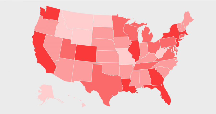
The site currently produces over 130,000 predictions on the county level every day. Simple in design, the site showcases four visualizations of data: a table with cases and deaths, a color-coded map representing where these cases are geographically and two graphs depicting the rise and fall of cases over time. On the map, viewers can click on individual states to see further cases within specific counties.
Bosch, Zimmerman, O’Neil and Wilson emphasize the accuracy of these predictions. While many politicians claim that these predictions are inaccurate, Zimmerman says otherwise, stating, “The politician goes on with the story relating to that, saying ‘the scientists don’t know what they’re doing, because they said according to this time, we’d have two million deaths.’ It’s because the scientists are working together to inform public health officials to inform the virus.” In the future, the COVID-19 Predict team hopes to expand their dashboard to incorporate global data.
Communicating science from academic environments to the general public effectively and efficiently has never been more important than it is now. These researchers from CWRU have demonstrated the magnitude of this pandemic and by giving public health officials accessible data, have worked to combat the spread of COVID-19 across the U.S. Within the anxiety and uncertainty of the pandemic, the smallest bit of information can help individuals take the necessary precautions, making the difference between life and death.
Correction: Originally, this article referred to the COVID-19 Predict project as a joint effort between Johns Hopkins University and CWRU. This is not the case. CWRU researchers merely used available data from Johns Hopkins to fuel the COVID-19 Predict project they developed independently.
Correction: This article initially referred to dashboards in plural. That was a mistake. The COVID-19 Predict project consists of a single, comprehensive dashboard.
Correction: Midway through this piece, we inadvertently began writing Jurgen when we meant to write Zimmerman. Jurgen is Dr. Bosch’s first name. We apologize deeply for this error.