

Kerby: Arrested for GUI
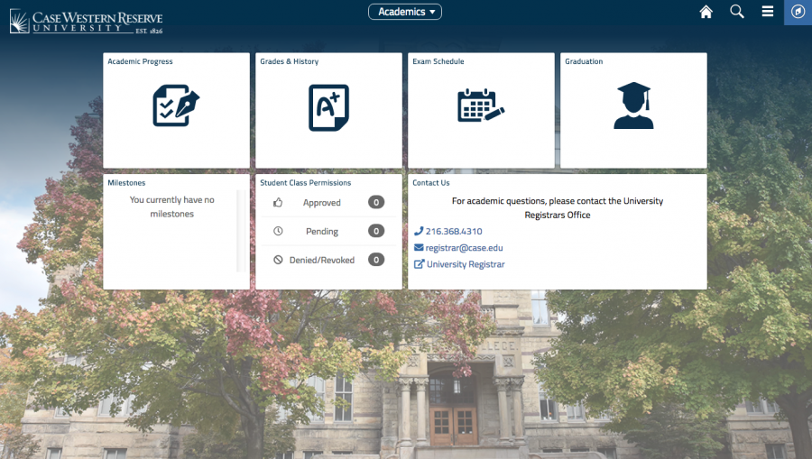
I’m not a scientist who can stare at computer jargon all day, and I expect that most people need a somewhat accessible graphical user interface (GUI). By this, I mean the layers of translation that make computer data readable and pleasant to humans. The nature of GUI and its role in human-computer relations became once again relevant to Case Western Reserve University life with the graphical overhaul of the Student Information System (SIS).
As far as I can tell, most of the changes to SIS are GUI upgrades or tweaks. The old SIS seemed an archetypical “ugly website,” a study in brutalism as web design. All joking aside, though, the visual upgrade is not completely unwelcome, and there are some below-the-hood changes as well. Take a look at the University Registrar’s webpage if you want an update log.
It was with apprehension that I tried to sign up for my senior capstone a few weeks ago on the updated SIS. First, I had to search for the course. Unlike the old SIS, the updated version does not have an avalanche of query fields one can fill in, instead asking for keywords. I find this change problematic, but I’m also a fan of very detailed query fields.
Once I found the class, there used to be a large friendly button to add the course to a shopping cart, but in the new system one must dig around a bit and find a small arrow pointing to the right. Unfortunately, I was not able to find the option to add anything; the button was missing. Thanks to some sharp minds at [U]Tech and in the University Registrar’s office, I got it all sorted out after a few days. But the error still caused a bit of stress, as I needed those classes to graduate.
So far, that is the extent of my time with the new SIS. It wasn’t the disaster I feared given past upgrades from rugged yet dependable systems, and it certainly isn’t the worst website at CWRU. Still, it warrants comments on the main tenet of the justification, that the new SIS is more streamlined and seamless. Does our single-minded pursuit of visual beauty extend to gritty websites as well? Will SIS get the Peter B. Lewis Building treatment, becoming an aesthetically pleasing but functionally deficient object?
From an idealistic standpoint, there should be a point at which aesthetic GUI upgrades are no longer productive. That would be when the temporary inconvenience of every button shifting around and initial kinks popping up is equivalent to the headaches averted by the more elegant setup.
If the main upgrades are mostly in the GUI, I would apply the non-derogatory term “trivial,” given that the functions of the updated SIS are not entirely different. The difficulties of trivial upgrades are that they are impossible to undo; the stress of a total overhaul or backtracking is far too great.
It is logical to shy away from sweeping changes when incremental changes are more accessible. Incremental changes allow for slow, continuous progress, but inhibit true structural changes. This small upgrade might mask some necessity for a completely different system that eliminates the weaknesses of SIS.
I’m at the tail end of my CWRU career, but we are the Spartans who will know both SIS systems. We will see whether the aesthetic upgrades outweigh the functional.
Steve Kerby is a fourth-year student studying astronomy and physics. When he grows up, he wants to be older.